We’re always told to break the mold, but sometimes you have to stick to the basics.
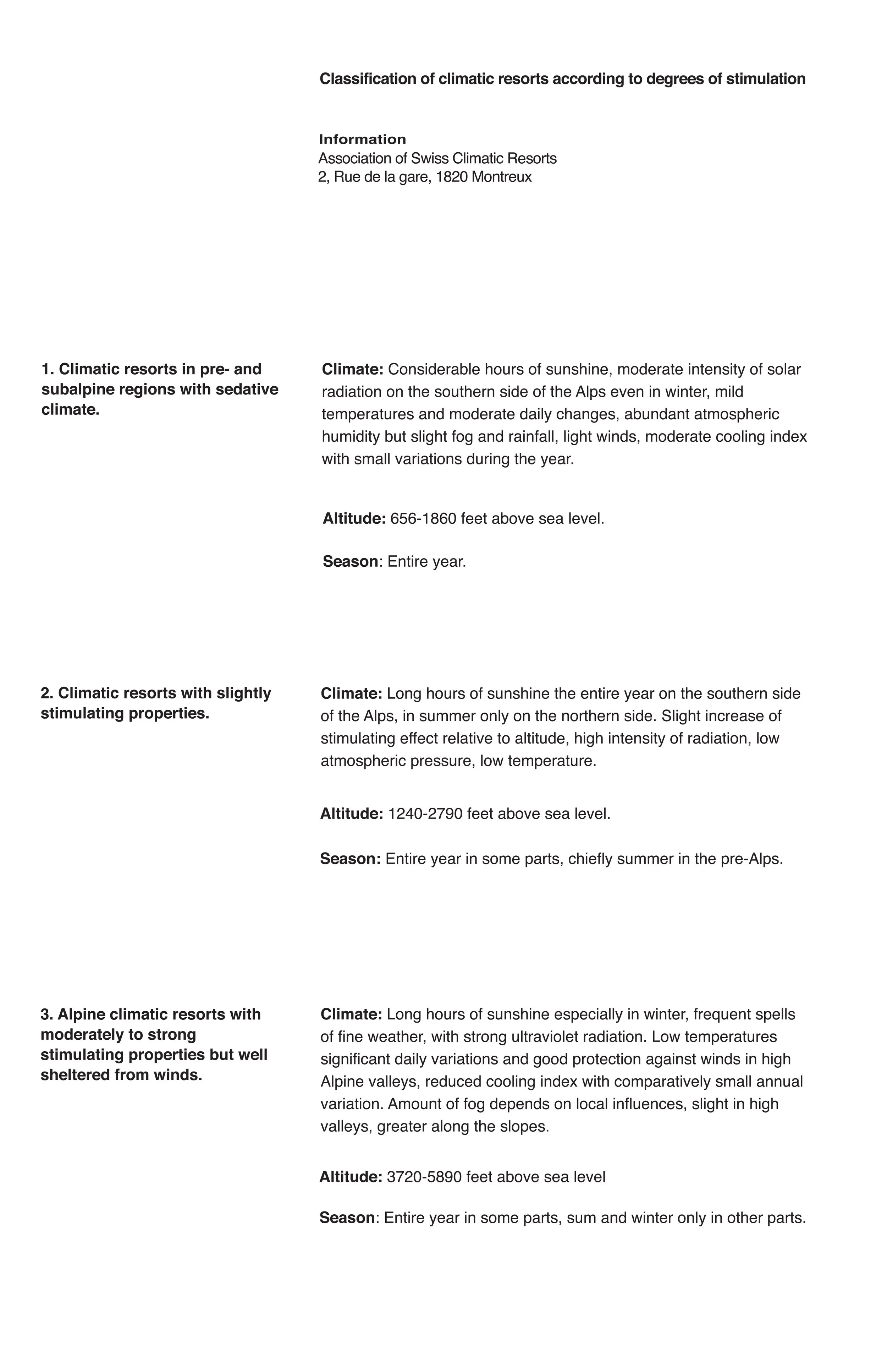
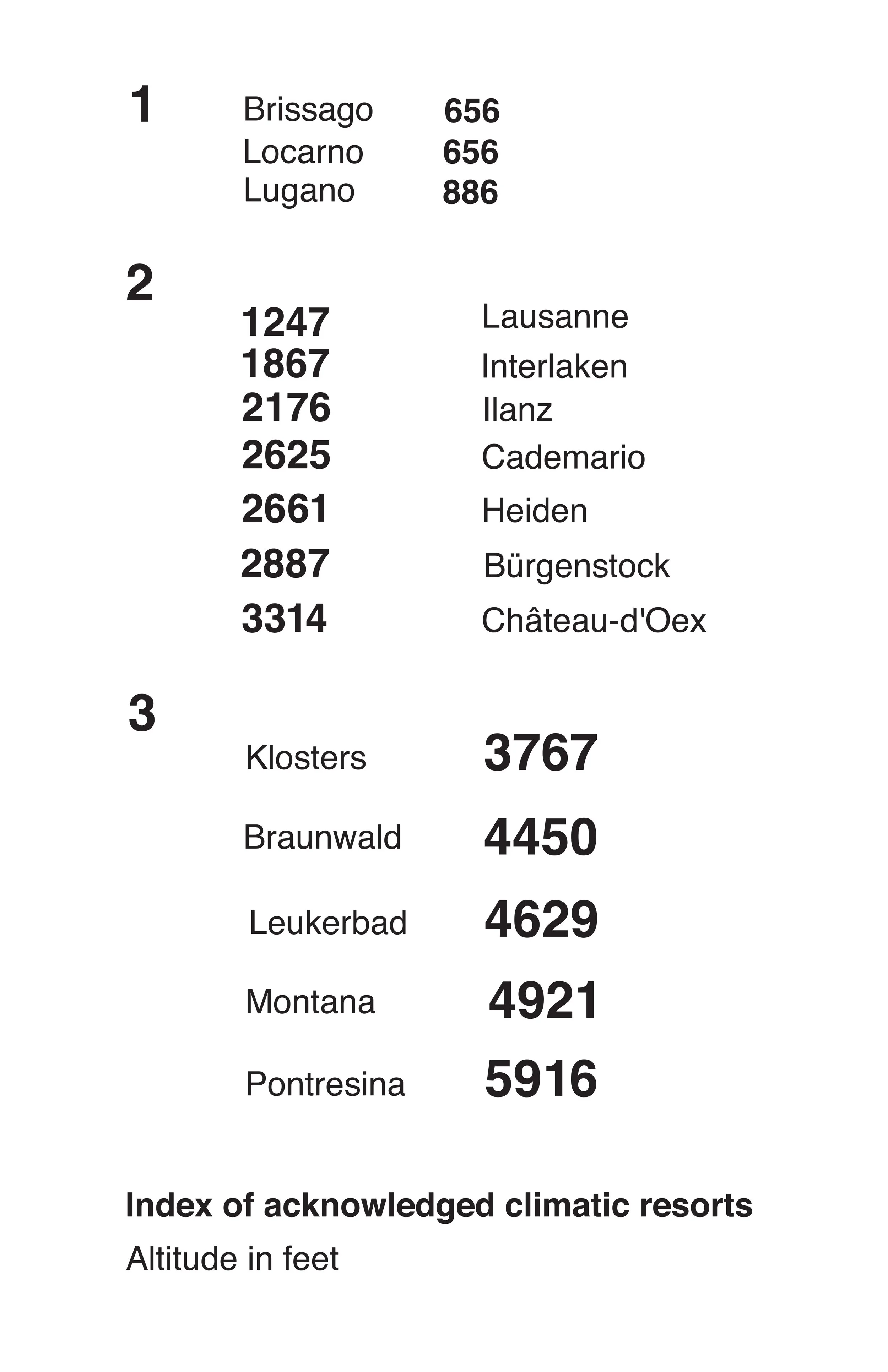
Typography and organizing it correctly is undeniably crucial in effectively communicating information. In this recent project assigned to me, my primary objective revolved around emulating the timeless Swiss typographic grids, while juggling three distinct sets of information. This was necessary to portray the importance of the data hierarchy, and the subsequent execution of suitable formatting using only the Helvetica typeface in various weights and sizes.
Color Palette
Font Choices
Helvetica


